Wednesday 8 May 2013

Evaluation Question 7: Looking back at your preliminary task, what do you feel you have learnt in the progression from it to the full product?


Front page:

My first task was very basic as it was my first time using Photoshop. It is very basic and there is a lot of white space which makes it look rushed. The colours make the logo hard to read and fonts used are very basic. The whole thing looks unprofessional and is of a very low standard. I think my skills have progressed a lot since my first task. The cover of my new magazine I think looks a lot better, the title stands out  and the text fits neatly on the edges of the cover not covering any of the artist’s face. The main artist is the clear focus with his name being a lot larger than the rest of the articles. There is use of different texts which helps place emphasis on different parts of the cover. There is no white space and overall it gives off a much more professional, finished feel than the first. This shows that not only have my skills in Photoshop developed, my understanding and creating of magazines have developed.
 

Contents Page:
The contents page from the first task is very basic. There is only use of on image which takes up the whole page, which makes the text on top of it hard to read. Similar to the cover in the first task, it is very basic and lacks simple details that would feature on a contents page such as a website or a contact number. My new contents page looks a lot more professional.  There is a band index, which was inspired from the NME context page. The text on the images are easy to read and the layout is a lot clearer, giving it a much more professional look than the first task which looks rushed, unprofessional and unfinished.


Evaluation Question 6: What have you learnt about technologies from the process of constructing this product?


Technologies I used whilst constructing my product. I used Web 2.0 to research already existing magazines. I used a professional camera to take the pictures which I was using in my magazine. The technology which dominated my product was Photoshop; I used this to edit the pictures, for example adding a greyscale. I then used a website called DaFont.com to find the fonts I wanted. I then uploaded my final products onto Blogger.


From this I have learnt that Web 2.0 is crucial to the process as without it, I couldn’t have researched into already existing magazines. I couldn’t have downloaded the fonts I wanted to use. I couldn’t have uploaded my final products to Blogger. I have also learnt how to use Photoshop more effectively and how to manipulate and edit photos in order for them to fit into my magazine.

Evaluation Question 5: How did you attract/address your audience?


Evaluation Question 4: Who would be the audience for you media product?

My target audience would be the young adult. Their music taste would be indie/rock bands such as Arctic Monkeys, Miles Kane, The Who and bands who generally don’t feature in the Top40 or fit into the pop genre. They would shop in places like River Island, Topman/Topshop and would try and stand out from the crowd in order to get the ‘indie’ look. They would watch programmes like Jools Holland in order to find up and coming bands. They would also go to gigs and festivals.


Evaluation Question 3: What kind of media institution might distribute your media product and why?


Evaluation Question 2: How does your media product represent particular social groups?


Tuesday 7 May 2013

Evaluation Question 1: In what way does your media product use, develop or challenge forms and conventions of real media products?


Final products

Front cover:
Contents Page:
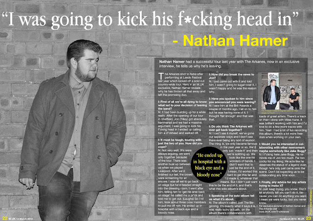
Double Page Spread:
 

Creating the double-page spread


Creating the contents page


Creating the front cover


Photo-shoots

I took 3 different photo-shoots, one in Skelmersdale, one in a friend's bedroom and another in another friend's living room. Here are a few examples of the photos I took.


Recce

Once I knew what appealed to my target audience, I immediately had an idea of where to take my pictures:

Recce

The pictures were taken in Skelmersdale, I chose this area because I felt it was effective and that it would fit into the magazine well.

Target Audience

When I was planning my magazine, I wanted to be sure it appealed to my target audience. My target audience was going to be from ages 15-30 who are fans of music magazines such as NME as they were my main inspiration. To do this I asked 20 friends and class-mates all within the age of my target audience a few questions in order to make sure I appealed to them.


 The results from the questions I asked shown that my target audience didn't just want a plain simple, colour scheme, they wanted something completely different and new. They also wanted the magazine to be featuring indie music and wanted the cover to feature a male artist. I was going to use this as a guideline when creating my magazine as I wanted to appeal to my target audience.

Sunday 28 April 2013

Planning the name

The name of my magazine was important to me because if the name didn't fit well then the magazine wouldn't be effective. I had to look at already existing magazine names and see what they had in common. I picked out names I liked and notice a common theme in most of the names, that they were short names, no longer than 3 syllables. This is so they would be catchy and easy to remember.

Already existing magazines:
NME
Rolling Stone
Q
Kerrang
Vibe

From that I realised that the name I had to come up with emulated that in order for it to be successful.

Names I considered:
M.UK (Music. United Kingdom)
Voice
Noise
Lyric

I liked M.UK as I felt it was most effective. It is also the same shape ad size of the NME logo, which is already a popular magazine so I'm glad it resembles it.
On the NME logo it also contains what it stands for (New Musical Express) which I wanted to feature on the logo of my magazine so the reader could understand what it meant, so I was going to try nd incorporate that into my logo.

Rolling Stone double page spread

This double page is very minimalistic, with a very short article it almost looks like a poster. It's completely different to the style of the contents page, as it doesn't seem as structured. Which shows that the double page spread is based around the artist rather than the magazine.

Rolling Stone contents page

The typical Rolling Stone contents page is well structured and straight. It's not the style I would go for but it contains a lot of information with the main articles containing pictures. The colour scheme is fairly neutral and plain so it would fit with any genre that was being shown in the magazine.

Rolling Stone cover

Rolling Stone is another major magazine that I looked at. It has featured huge stars which makes it so successful as people want to read about them. The celebrities they have on the cover of Rolling Stone varies from the likes of Jay-Z and Kanye West to Madonna. I really like this cover as it's different from the typical Rolling Stone cover. I like the contrast of the black and white image with the yellow text. Rolling Stone covers don't usually give much away of what features in the magazine and what the articles are about. They rely heavily on their own reputation and the reputation of the main artist on the cover to make readers want to buy it.

Friday 22 February 2013

NME double page spread annotated


NME Double Page Spread

Each double page spread in Nme is different. The style is altered in order to match the style of the artist. The double page spread never matches the colour scheme in Nme of red white and black as the double page spread is designed around the artist featured in it. The majority of the double page spreads featured in Nme contain an image of the artist covering the left page with the title, or a quote, from the article in big text, with the article itself being on the right. However, some of the articles in Nme adopt a different style. Some, such as the Florence and the Machine article contain the image accross both pages, with the title going across both pages as well. Similar to the other type of double page spread, the article itself on features on the one page.


Thursday 21 February 2013

NME Contents Page anotated

This is filled with information and isn't really how I'd like mine to look as I feel it is too busy and as a reader I feel I don't know where to look as there is too much informaton on one page. In another sense it utilises the space as there is very little white space on the page, which gives the reader the impression they are getting a lot for their money.

NME Contents Page

In the NME contents page there are two main set outs. Both of which have a simple layout and contain a lot of information about what's going to be in that specific edition of the magazine. The first type of NME contents page contains more text than images, this is so it can hold more insight into what is inside. The other type is more dominated by images, this is to catch the readers attention to specific articles.